The Postcards of Eugenia Matons Rossi
- Adriana Rodriguez-villa
- Feb 5, 2024
- 11 min read


This essay will be focusing on the importance of postcards and deltiology in architectural culture.
The aim of this essay is to walk the reader through the findings of my grandmother’s personal archive and to interpret the importance of postcards in the 20th century as compared to the 21st century. This analysis will be done by evaluating various interpretations of the postcard as an object and the implications of the image printed as transcripts of specific moments.
The main historiographical references which stand at the base of this essay include Rem Koolhaas’ book, ‘Delirious New York: A Retroactive Manifesto for Manhattan’, ‘Postcards and the Making of Architectural History: The Cases of Alvin Boyarsky and Rem Koolhaas’ by Igor Marjanovic alongside other resourceful books and articles which shaped the overall structure of this piece by offering insightful glimpses into the world of postcard photography of New York.
Chapter One: What Are Postcards?
An initial interpretation defines postcards as cardboard pictorial documentation for travel used for mailing without the need to use an envelope. A second illustration lies on the intent behind the print. Postcards are commercial propaganda, crossing the boundaries of language, race and geography to present a debatably collective and commercial vision of a space.(1) They add to the complex history of visual culture as they preserve architectural expression through mementos.
Although the correspondence of pictorial imagery has been suspected to happen for centuries, it was at the end of the 19th century where the mass production (due to industrialisation) allowed the commercialisation of such.(2) The collection of postcards as a hobby became in tandem with the consumer culture of the time. The appeal to collect postcards, known as delitiology, is now related to the fascination for the vintage. Our means of communication have been alternated. As technology has advanced, instant correspondence through messages and photography is now available. However, postcards possess a tangible, unique quality as tactile photography; lipstick stains, blotches of ink or the smell of perfume add to the personal significance of the message.(3)
The messages on the backside of postcards tend to be brief, intimate and informal as they tend to express personal news through writing and sometimes small illustration. A postcard’s nature manages to become an oxymoron, to cross limits such as being semi-public(4): although they are addressed to a singular person (explicitly personal) they also share quite open nature ( the text, imagery and stamp can be seen by everyone). From my reading of “Postcards as media” I was insulto trigued by the translation of the Russian word открытка (otkrytka) as ‘open’ or ‘revealed’. In my opinion this notion shows the lack of privacy of postcards.
Through the images on postcards, specific geographical places become icons and are immortalised. They carry cultural values and almost define the places. If someone who has not travelled to Italy was asked to describe Rome visually, they would generally start by mentioning the Colosseum. This association can implicitly be linked to stereotypical postcards that might have travelled to that country. The images used for postcards cannot be considered neutral means of information as they are catered strategically to encourage travel.
Chapter Two: The Postcard Collection of Eugenia Matons Rossi

An archive of postcards that belonged to my grandmother was mentioned after dinner at my aunt’s house which brought about various conversations regarding the captured places. My aunt had been going through my late grandmother’s room and found two shoe-boxes of postcards, both sent and unsent, revealing trips and friendships. My grandmother was a cosmopolitan woman; she spoke seven languages and wrought one of the main medical societies of Spain. She combined her motherly duties with trips around Europe. I couldn’t help but wonder if at times my grandma had used these postcards as an escape from her duties as a housewife or as a way to reminisce about her travels. Why did she collect them? Looking through the small portion of the archive which I took back home two images stood out. Both of them show the same city and its fantasies of nightlife in different eras and boroughs. I believe what made them stand out was that they were the only ones showing nocturnal paradigms.

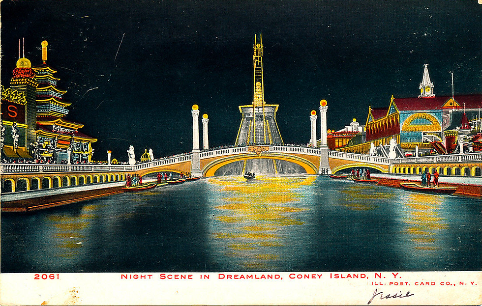
When looking at Figure 1 without paying attention to the text I believed it presented a watercolour illustration of an imaginary architectural dreamscape: the vibrant colours and the amusing structures surrounding the canal extended an invite to the interpretation of an experimental playground. Almost immediately I recognised the influences of Asian culture and assumed the middle figure was some kind of futuristic tower hidden by the “Venetian” arched bridge.
Upon a more focused observation, on the bottom left corner we can see ‘2061 Illustrated Post Card Co., N. Y.’ To my surprise, the postcard was a black and white photograph that had been painted with colour on top. Within the illustration (towards the bottom right) the following words appear 'Copyright 1906 Illust Post 8 Nov, N. Y’. This dates the initial print production of the postcard for the 8th of November of 1906. The caption right below the image of the postcard reads ‘Night Scene in Dreamland Coney Island, N.Y.’ Hence my initial experience of the postcard was shattered, it was inaccurate, but one of the primary functions of a postcard is to cultivate an image of paradise to encourage travel.
Dreamland was a project pursued by William H. Reynolds (a former Republican state senator). It was the last of the original three amusement parks built in Coney Island. The park was inaugurated in 1904 and was short lived as in 1911 the funfair was engulfed by flames. Its success and demise both come from Reynold’s vision to be the greatest park near the turn of the century.(5) One could argue that the postcard had more of a promotional value for him as the park was a risky investment considering the competition was so close together. This strategy quemarket the amusement park to outsiders at a time where advertisement would generally come from newspapers.
Anticipating the dilemmas of Modernism, Reynolds aimed for it to become a post-proletarian park, a park that would appeal to all classes. It is therefore not surprising for postcards of the site to be produced as in the early twentieth century, the postcard exemplified modernity.(6)

When looking at the distribution of the park (Supporting Evidence 1), the postcard seems to be facing away from the central tower towards the ‘shoot-the-chute’ attraction. The theme of the park was supposed to represent an underwater scenery. The man-made lagoon reflects the light of the moon as well as the 1 million electric lights surrounding it. To the left, stands a building which is supposed to represent a two story ornate Japanese temple with a tiered pagoda roof. To the right the words ‘Ballroom Restaurant’ and ‘The Bowery’ can be seen on the side of a building with a flat roof with two hips to its side. ‘Steel Pier’ can be seen extending itself seaward on the right side of the image. Silhouettes of people melt in between the lights and the structures of the railing and the pedestrian bridge connecting both sides of the postcard. Furthermore, figures can be seen floating around the deck and on a central boat which induces visual context and depicts details regarding the success of occupation of the park only two years after its opening.
Although the intention behind the park was purely a commercial investment, it captivated people through the pleasures of a fantasy world. The architect scattered simulations of famous landmarks within the site, allowing a tangible experience of travel when it was not accessible for most. The legacy of this magnificent sight to behold lies on the projections for future theme parks as places of wonder.


The second postcard that I found deeply intriguing is the one pictured in Figure 2. There is a clear view of a cityscape - a sea of skyscrapers divided through two streets which is full of neon advertisements hinting at the highly capitalist American aesthetic, with a strong focus on commercialism. What caught my attention was the lack of people and the few inhabitants of the space were cars. Nowadays it would seem atypical to see Times Square without a sea of tourists' heads. The metropolitan landscape hurdles the dating of production of the postcard. The information provided by the placards and neon signs estimate the photograph to be shot from 1960 to 1964.
The main focus of this postcard is One Times Square, built in 1904. The building has three neon signs: 'Chevrolet’, ‘Canadian Club - Imported Whisky’ and ‘Admiral Television Appliances’. Two supporting images from 1955 and 1958 helped decipher what the signs said and register the permanence of them.
Behind One Times Square the weather star perched on top of the MONY building’s roof can be seen. The building was built in 1950 and is now the spot for AXA. In the background three neon signs promote two hotels and one theatre. To the left, ‘Capitol Theatre’ can be seen. The building acted as a movie theatre from 1919 to 1968 when it was demolished. To the centre, ‘Park Sheraton Hotel’ stands on top of the building. (Built in 1897, the building took that name in 1948 until 1972 where it changed again.) To the right, two stars ‘Hotel Victoria’ can be seen. The placard at the right of the image states ‘A Vote for Wagner (Sept 7th) is a vote for Bossism’. Robert F. Wagner Jr. was elected mayor of New York in the elections of 1953, 1957 and 1961. To the left on the foreground is the icon for ‘Hotel Astor’ in operation from 1904 through to 1967. To the right, ‘Loew’s State’ Theatre sign can be seen. The theatre closed in 1989. One thing I immediately noticed is the typified design of the skyscrapers - hundreds of small identical windows which show the ever-growing density of the cityscape.

When inspecting the back of the postcard (Figure 3) the serial number (70336-B) and the manufacturer of the print (Dexter Press Inc) could be seen at the bottom of the postcard. It set the issue’s print in 1964.(7) One thing to note is the succinct description in the left corner of the card describing Times Square. It demonstrates people were unbeknownst to the wonders of travel. At a time known as the golden age of travel, the world opened itself and postcards had the quality of a trophy. Many could simply not afford to cruise around the world, especially living in a country run by a fascist dictatorship. My grandmother lived in Spain most of her life and was both a businesswoman and a housewife. However, her means to travel outside of Spain were restricted. The postcard exchange was dynamic, creating a context-sensitive narrative. This poses the question on where did this postcard come from? When asking my aunt she suggested an Italian priest, a friend of my grandmother’s, might have given her this postcard after a mission in the states. The second postcard’s backside (Figure 4) has no additional information. There is no personal message, no stamp. Searching for a culprit we concluded that it reached my family through my great-aunt Vicki, who emigrated to the United States in the early years of the 20th century.
These postcards present fragments of the past, some layers of phantom architecture of past occupancies through their images.(8) Ghosts of what used to be in the city of New York display the development of its societal framework. Both One Times Square and Dreamland were constructed in 1904. Two separate functions developed within the space of one city: One being a mechanical fantasy and the other dictating the metropolitan way of living.
Looking at the context for both postcards it is clear to see the development of New York city as the embodiment for metropolitan lifestyles. At their respective times, the areas presented by the postcards acted as spaces where experimentation through architectural mutation was valid. The island was a testing space between 1890 and 1940 to factory a manmade experience. Additionally, Coney Island was used as the incubator for Manhattan's nascent themes and infant mythology.(9) Through its culture of entertainment, the limits of what a “normal structure” was had disappeared. Had it not been for architectural entrepreneurs that probed with the creation of different isolated constructions, the Manhattan metropolitan skyline might have been completely different from the actual contemporary urbanism.
“Manhattan has consistently inspired in its beholders ecstasy about architecture” - Rem Koolhaas
“... architecture in form of past occupancies, aborted project and popular fantasies” - Rem Koolhaas
Moreover, architects experimented with the structure of the city. For Rem Koolhaas, Manhattan had ‘irrational phenomena’ such as the Radio City Music Hall and was a space for ‘utopian fragments’ such as the Rockefeller centre and the United Nations building.(10) Currently, we disregard the importance of these buildings as the incipient constructs for design in urbane developments.
Chapter Three: The Transition. From Printed Paper to Digital Pixels, From Postcards
to Instant Images
A postcard’s vocation is to act as social images. Images are statements that can start discussions about themes such as the future of architectural landscapes.
Postcards construe relationships. The back allows itself to be customised even though it presents a quasi-identical frontal image in each print. There is a sense of nostalgia provided by the still image as it captures the environment and the time constraints. In a way, the front of the postcard is an image not susceptible to editing; a crude image.(11) The production of a postcard follows a chain. First, the architect builds a structure. Then, the photographer takes an image of it and the print decides to issue an amount of copies of it. Generally, old prints would not be printed with colours and illustrators would add colour to highlight the elements within it. This emphasis managed by colour allows interpretation of the built as if it were a painting. An example being the moon in the print in Figure 1 as compared to the identical print shown in Supporting Evidence 4. Finally the print would be sold at different spots enabling tourists to express their travels visually.
In comparison, social media allows messages and images to be sent almost instantly but lacks the tactile nature postcard photography has. Additionally, the semiotics of a postcard have been adapted to be brief and at times include pictorial elements such as a heart or a flower.(12) The briefness of a postcard is now embodied by mobile applications such as Twitter. Instagram’s posts share images that are still.
As the production and retail of postcards decline people reject the idea of them disappearing forever. Postcards manage to carry a sentimental value as they address a single person directly. I believe the future of postcards is to act as support in the narration of a travel.
Conclusion: How Do Postcards Influence Architectural Culture?
In conclusion, a postcard can be inspected to give two different aspects. On one hand, postcards can be defined as objects - they are seen as both political and timely. When a postcard is printed, the image becomes a product with economical value. As a commercial product, it publicises spaces to tourists. Postcards serve as artefacts of material culture and architecture is a product of culture. Through postcards people are able to share personal experiences of spaces travelled to and to emote through a brief dialogue.
On the other hand, postcards can be defined as portable images. Postcards are the predecessors of social media. They display space to the general public which can show both public or private estates. There are no limits to what can figure inside the image. For this essay I focused on non-fictional spaces. A postcard’s iconography translates into emblematic spaces and preserves moments in time. A monument can not move, but its image can. The image print presents some kind of consciousness on the value of culture. In particular through both postcards it has captured the creation of a space of wonder and a metropolitan area respectively.
In my opinion, postcards are a clear example of the success of images as representations of architectural culture. Its ability to provide information lies on the layers presented when analysing an image. As the chinese proverb declares “An image is worth a thousand words”
Bibliography
I would like to acknowledge these papers as influences for this study. This bibliography is structured in order of appearance:
Marjanovic, Igor. 2004. Acsa-Arch.Org. https://www.acsa-arch.org/proceedings/Annual%20Meeting%20Proceedings/ACSA.AM.92/ACSA.AM.92.79.pdf.
Unknown. "Postcard History". 2022. Smithsonian Institution Archives. https://siarchives.si.edu/history/featured-topics/postcard/postcard-history
Milne, Esther. 2022. "Letters, Postcards, Email: Technologies Of - Proquest". Proquest.Com. https://www.proquest.com/legacydocview/EBC/481114?accountid=14511
Östman, Jan-Ola. 2004. "The Postcard As Media". Text - Interdisciplinary Journal For The Study Of Discourse 24 (3). doi:10.1515/text.2004.017
Koolhaas, Rem. 1994. Delirious New York. New York: Monacelli.
Prochaska, David, and Jordana Mendelson. 2010. Postcards. University Park, Pa.: Pennsylvania State Univ. Press.
"Dating Dexter Press Postcards | Postcard History". 2022. Postcard History | A Magazine For The Postcard Collector. https://postcardhistory.net/2021/10/dating-dexter-press-postcards/
Unknown. "Rise And Fall Of The Postcard: A History Of Visual Culture In Modern Tourism – Centre For The Study Of Modern And Contemporary History Blog". 2017. Research.Shca.Ed.Ac.Uk. http://research.shca.ed.ac.uk/csmch/2017/10/15/rise-and-fall-of-the-postcard-a-history-of-visual-culture-in-modern-tourism/
Cure, Monica. 2018. "Picturing The Postcard: A New Media Crisis At The Turn Of The Century.". https://doi.org/10.5749/j.ctv80c9gb.

Comments